We grilled five of our favorite designers and asked them to share the daring paint colors they are leaning toward right now—and just where to use them.
1 Pitch Black by Farrow & Ball

“Repaint existing kitchen cabinetry in a high gloss black paint (like Farrow & Ball’s Pitch Black). It will add just the right amount of drama to your kitchen, and, mixed with brass hardware, will feel elegant and timeless. I also love black for an alcove, powder room, or bedroom. It’s really bold, but mixed with the right pieces, will make the perfect statement. Black paint will up the ante in any room.”
—Nate Berkus, Los Angeles-based designer
2 Grappa by Benjamin Moore
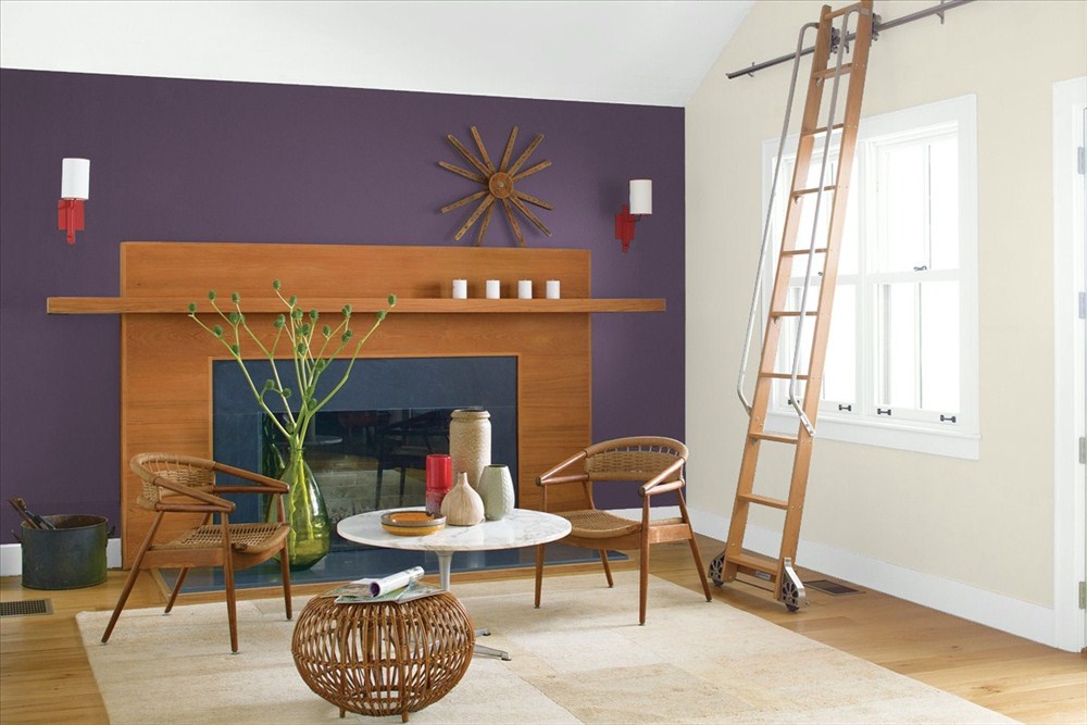
“I am wild about the color purple as the newest neutral! Used in a media room, it becomes a comfy, snuggly place to escape to. A base of a dark brownish purple, like Benjamin Moore’s Grappa, can be paired with a dramatic bright for some sizzle (Try an herby green like Avocado) or create a more sultry look when combined with a brown (like Brown Horse). Add a creamy ivory (like Seapearl) for contrast and cooling, and you’re set.”
—Elaine Griffin, New York City-based designer
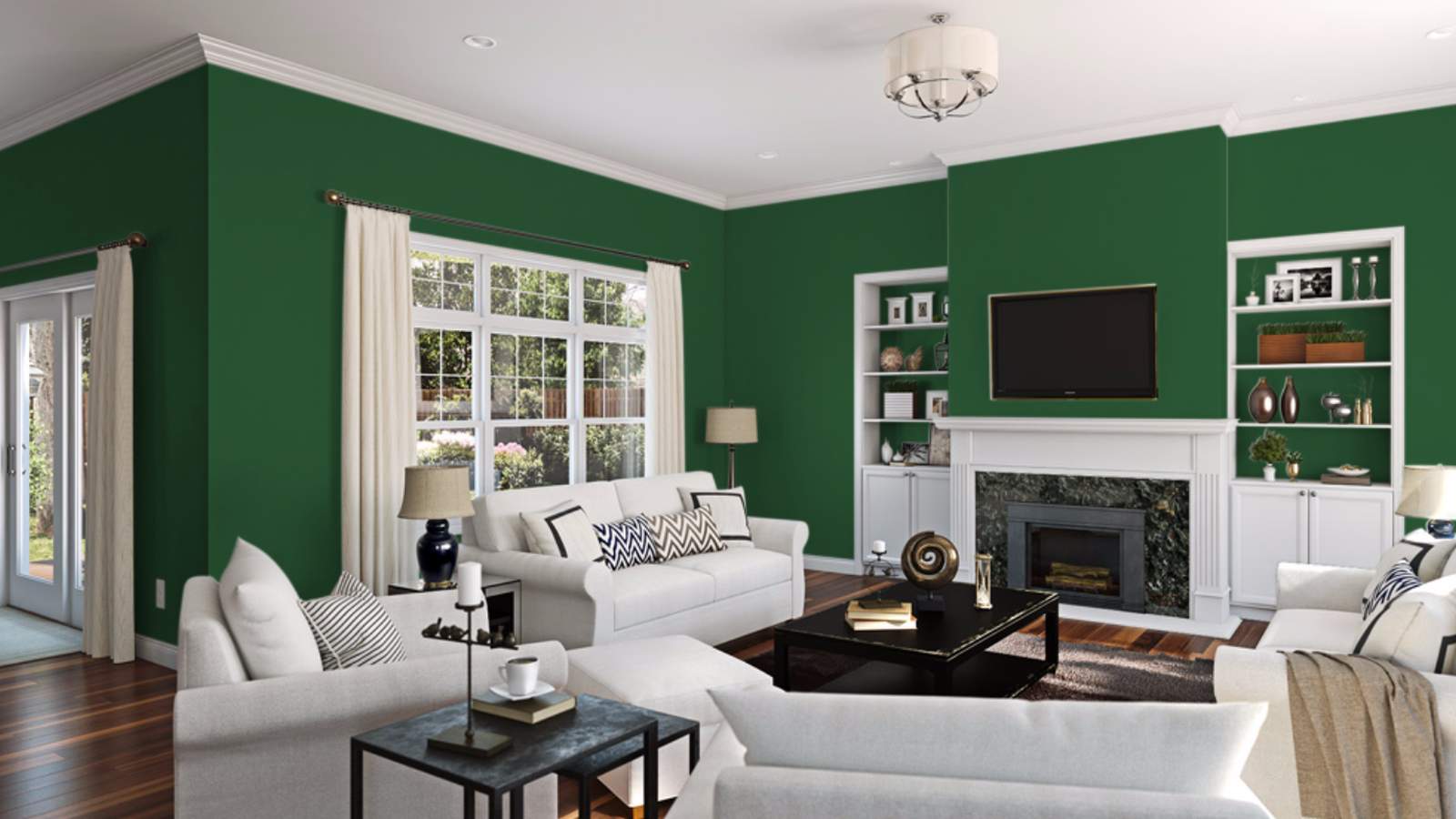
3 Moss Cottage by Dunn Edwards

“I am very heavily debating painting my kitchen cabinets a dark, bold green right now and am loving the saturated tones that Dunn Edwards’ Moss Cottage offers without it going too evergreen.”
—Emily Henderson, Los Angeles-based designer
4 Espalier by Sherwin-Williams

“Green is coming on strong for 2017. Sherwin-Williams’ Espalier reminds me of the hunter greens from the ’80s, except its undertones are a bit less blue, making it great in a study or family room. Try it on built-in cabinetry and shelves for unexpected impact.”
—Tobi Fairley, Little Rock, Arkansas-based designer
5 Dash of Pepper by Benjamin Moore
“In an office, try Dash of Pepper from Benjamin Moore. Paint it on all the surfaces including bookshelves & the ceiling. It will create a welcoming cocoon. Mix with tonal, textured fabrics, and the space will feel like a timeless retreat. ”
—Tracy Morris, Washington, D.C.-based designer
6 Deep Rose by Benjamin Moore
“A color that I think we’ll see more of in the coming months is red. People are a little nervous about using this color in their homes, but I think it really adds a lot of personality. Benjamin Moore’s Deep Rose would be fantastic in a dining room, a kids’ playroom, or in a powder room. The powder room, especially, is a great place to experiment with strong color. Red is an energizing color, though, so definitely don’t use it in a room that you want to relax or sleep in.”
—Tobi Fairley
Source: https://www.realsimple.com/
Table of Contents